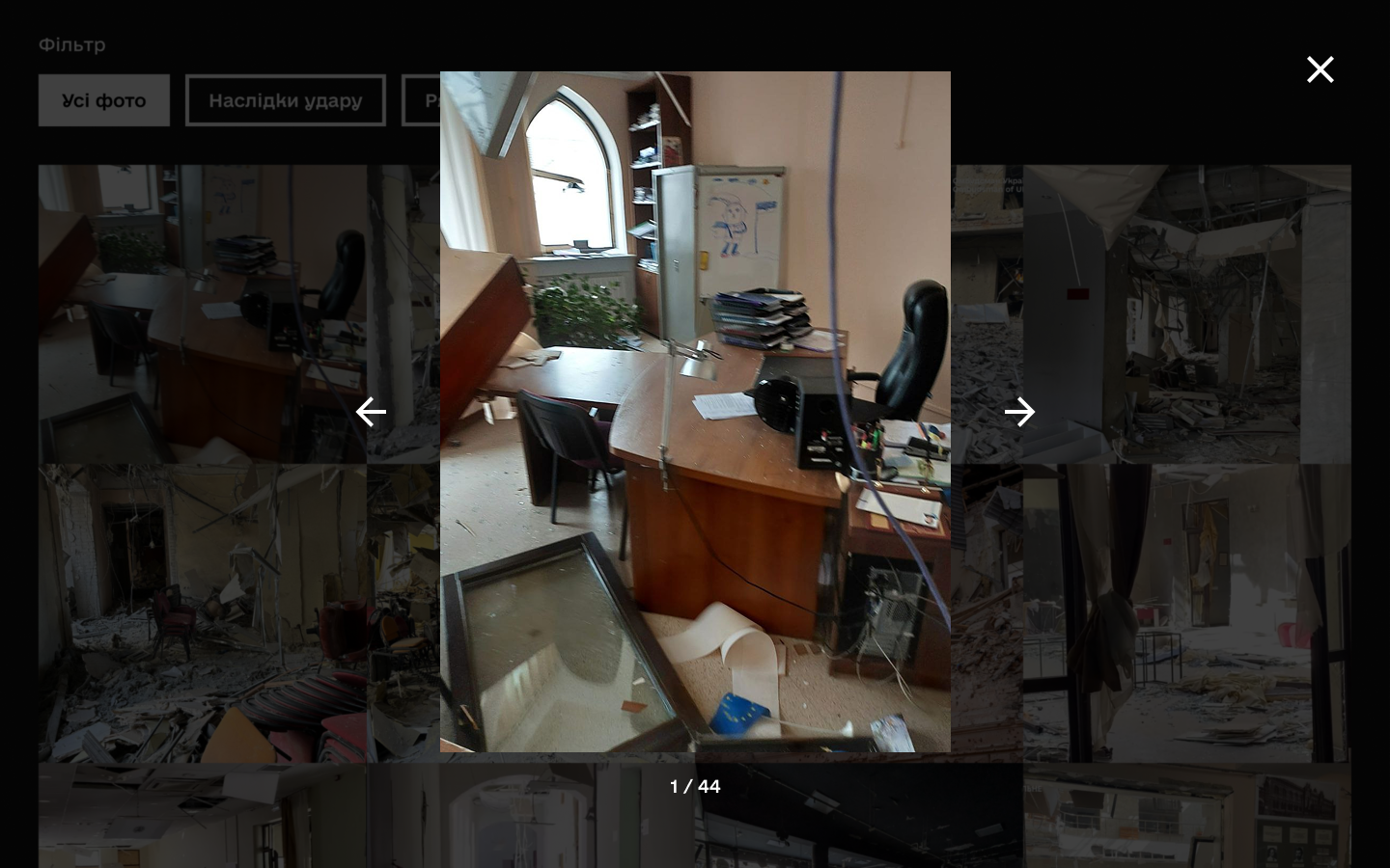
Welcome here! I am Ivan Tkachenko, UI/UX Designer
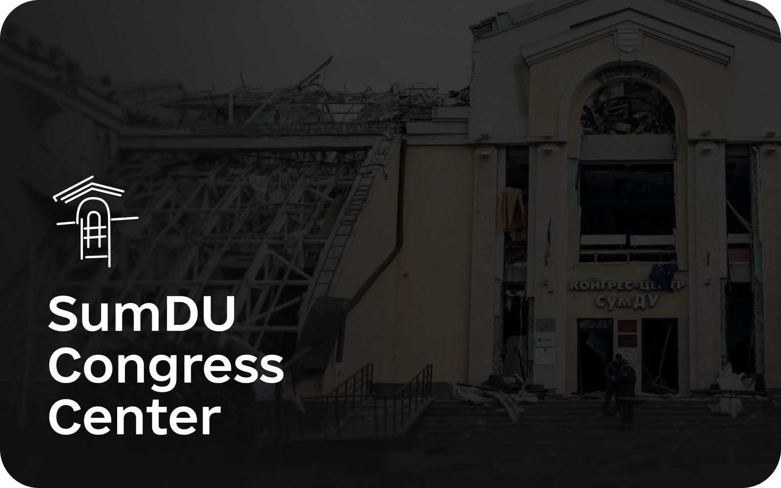
Designing memorial site for social impact and transparent reconstruction
View full case →
#UXCaseStudy #UXResearch #EmotionalUX #InformationArchitecture #Figma
2026
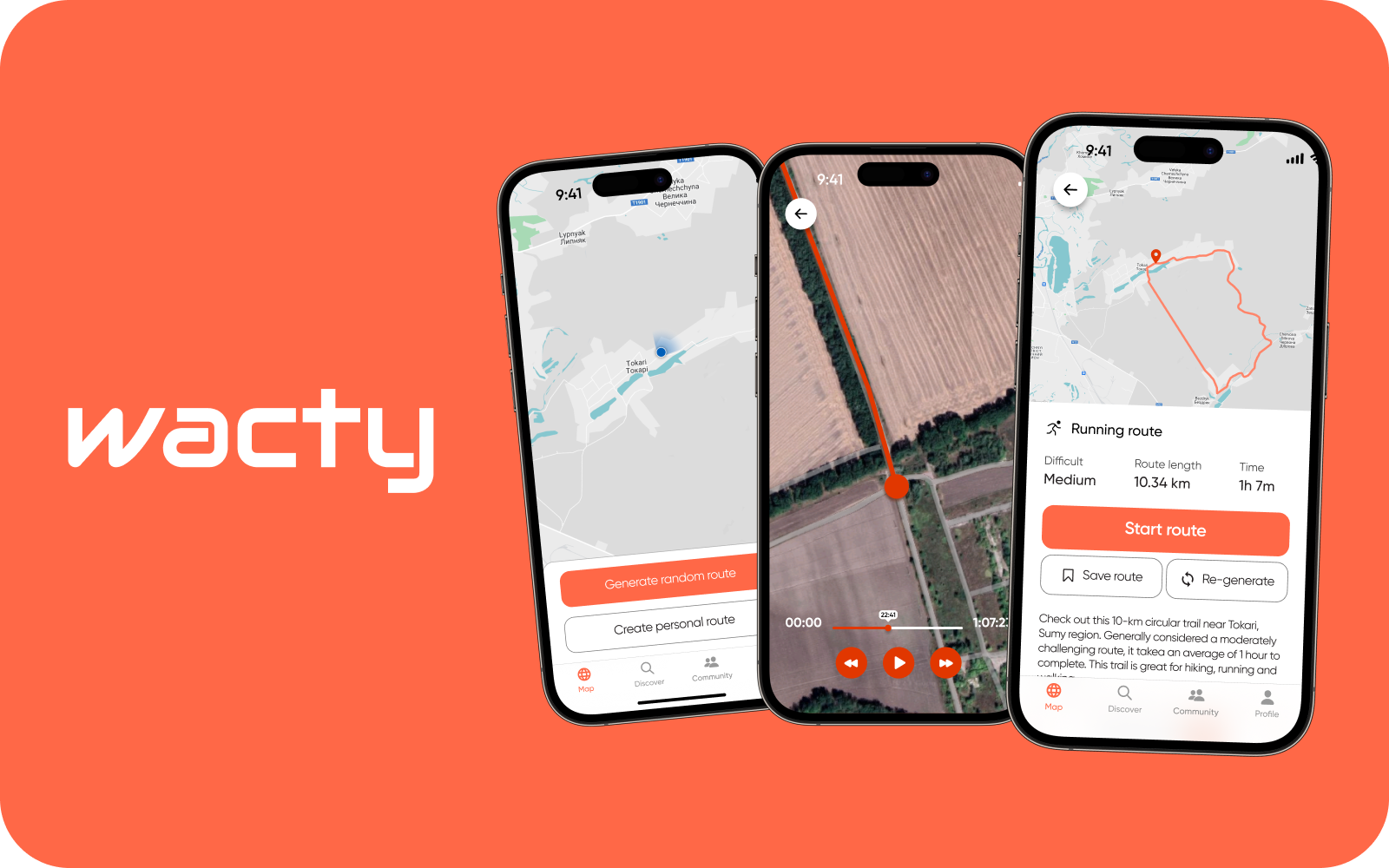
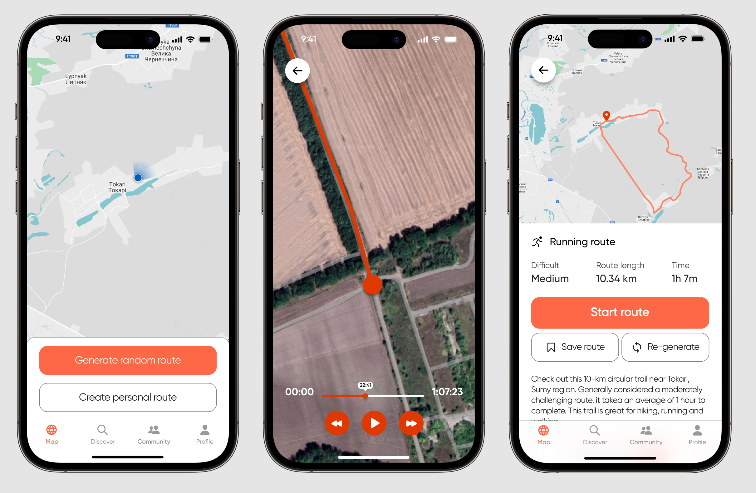
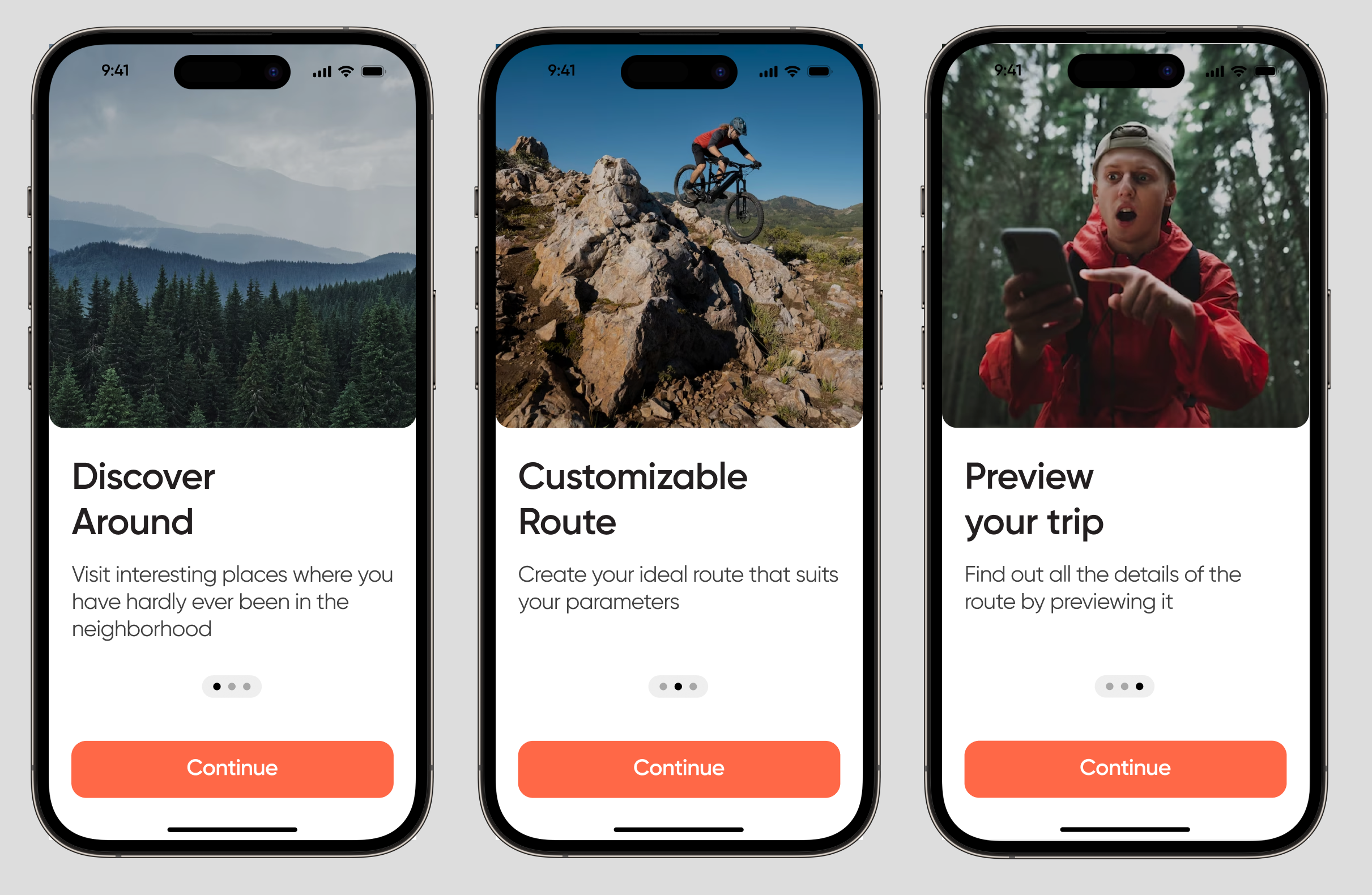
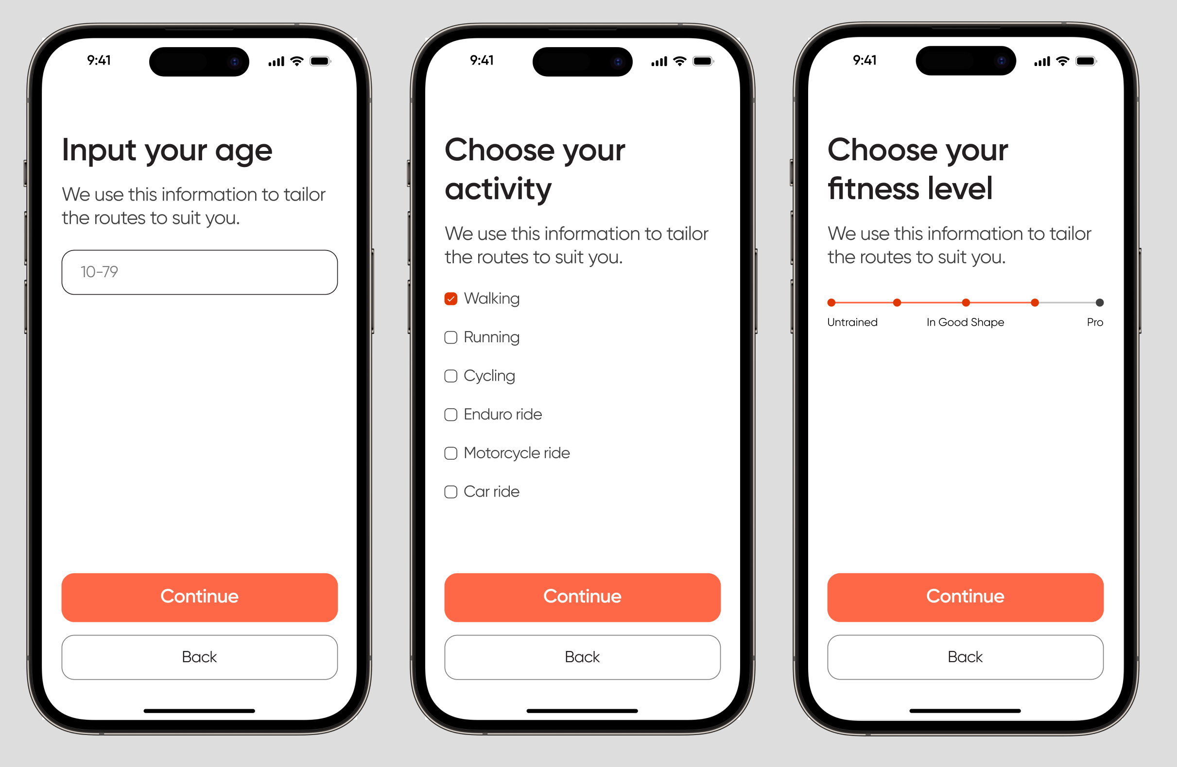
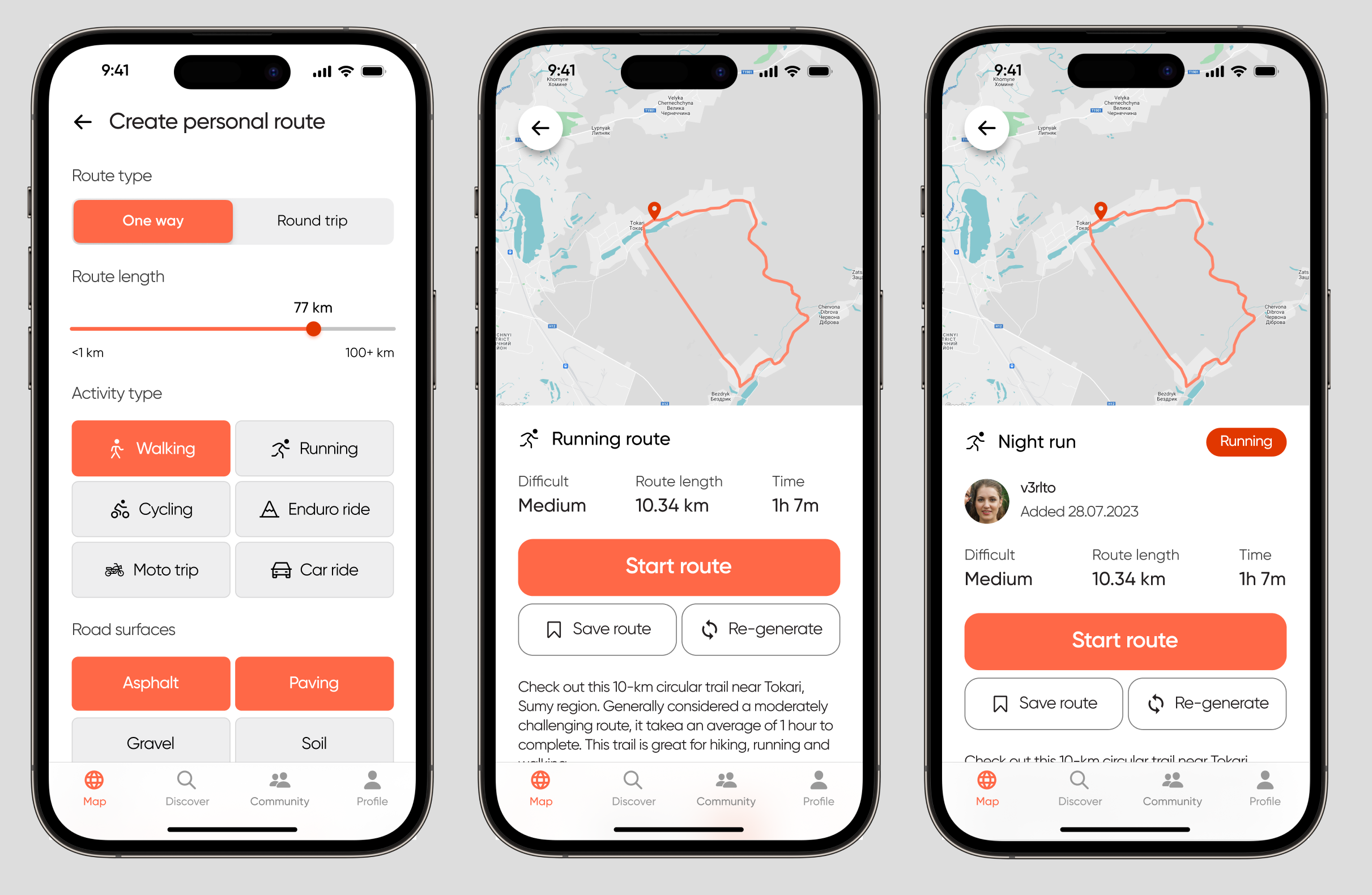
Eliminating user drop-off by automating manual planning workflows in travel app
View full case →
#UXCaseStudy #ProductDesign #TravelTech #DesignSystem #MobileApp #UXResearch #Figma #UserRetention
2024
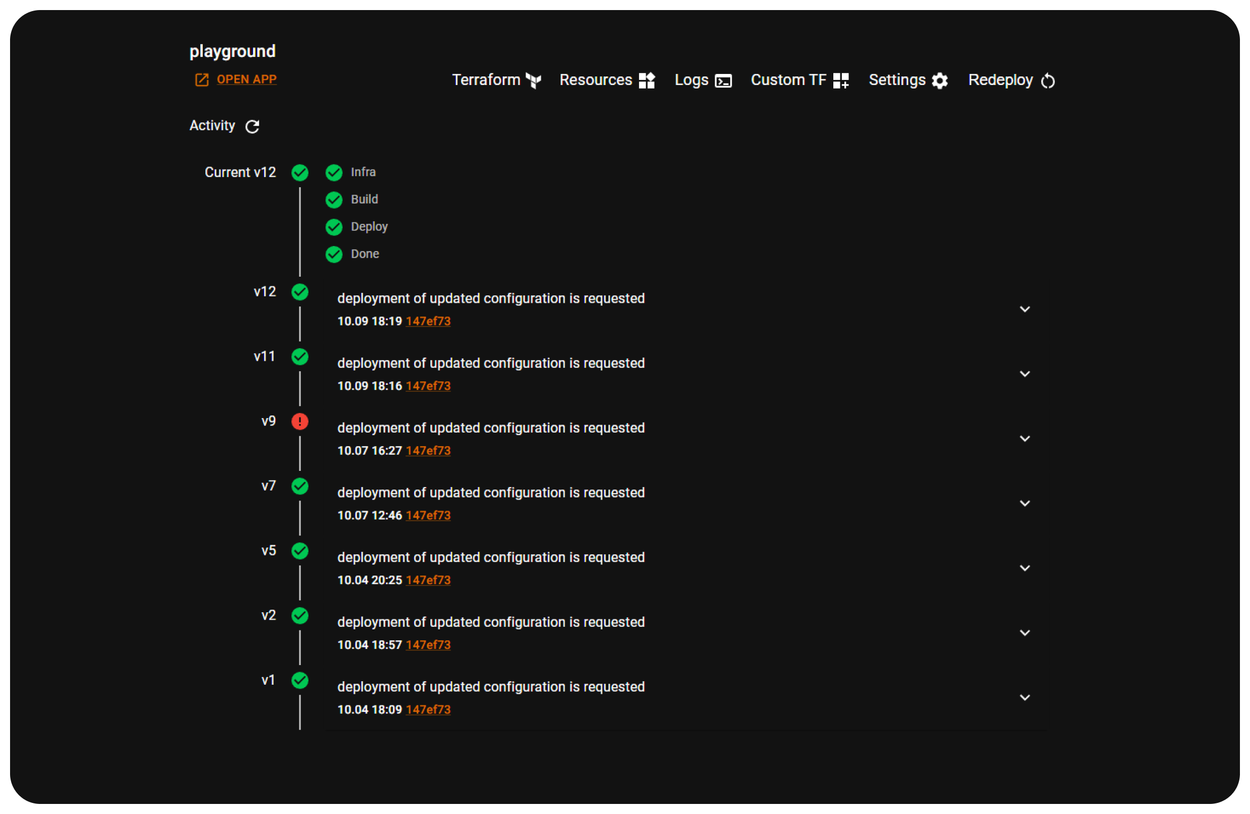
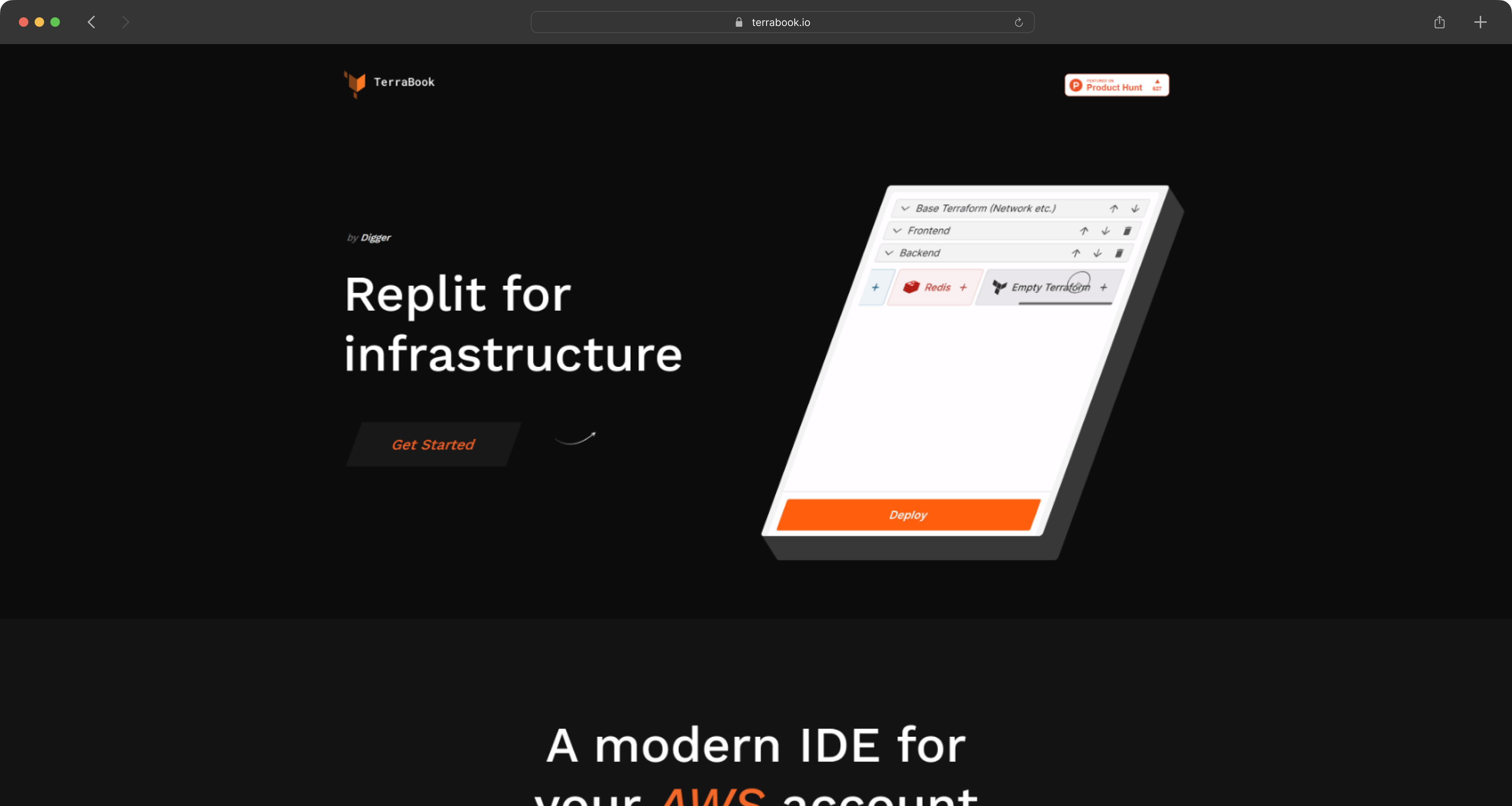
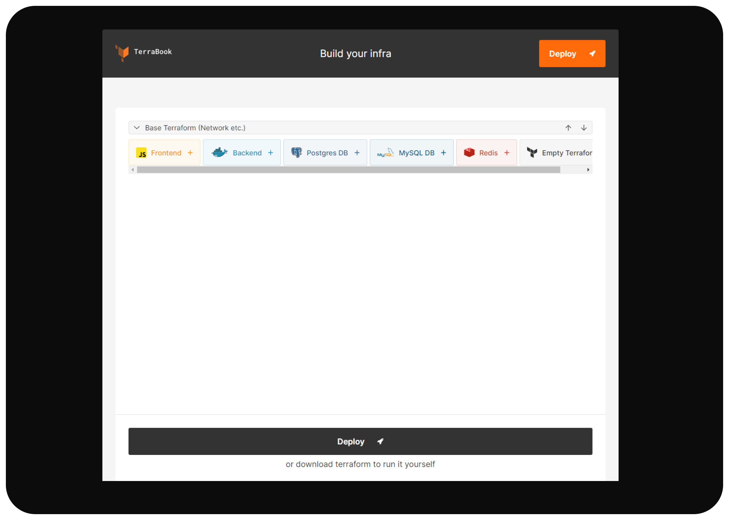
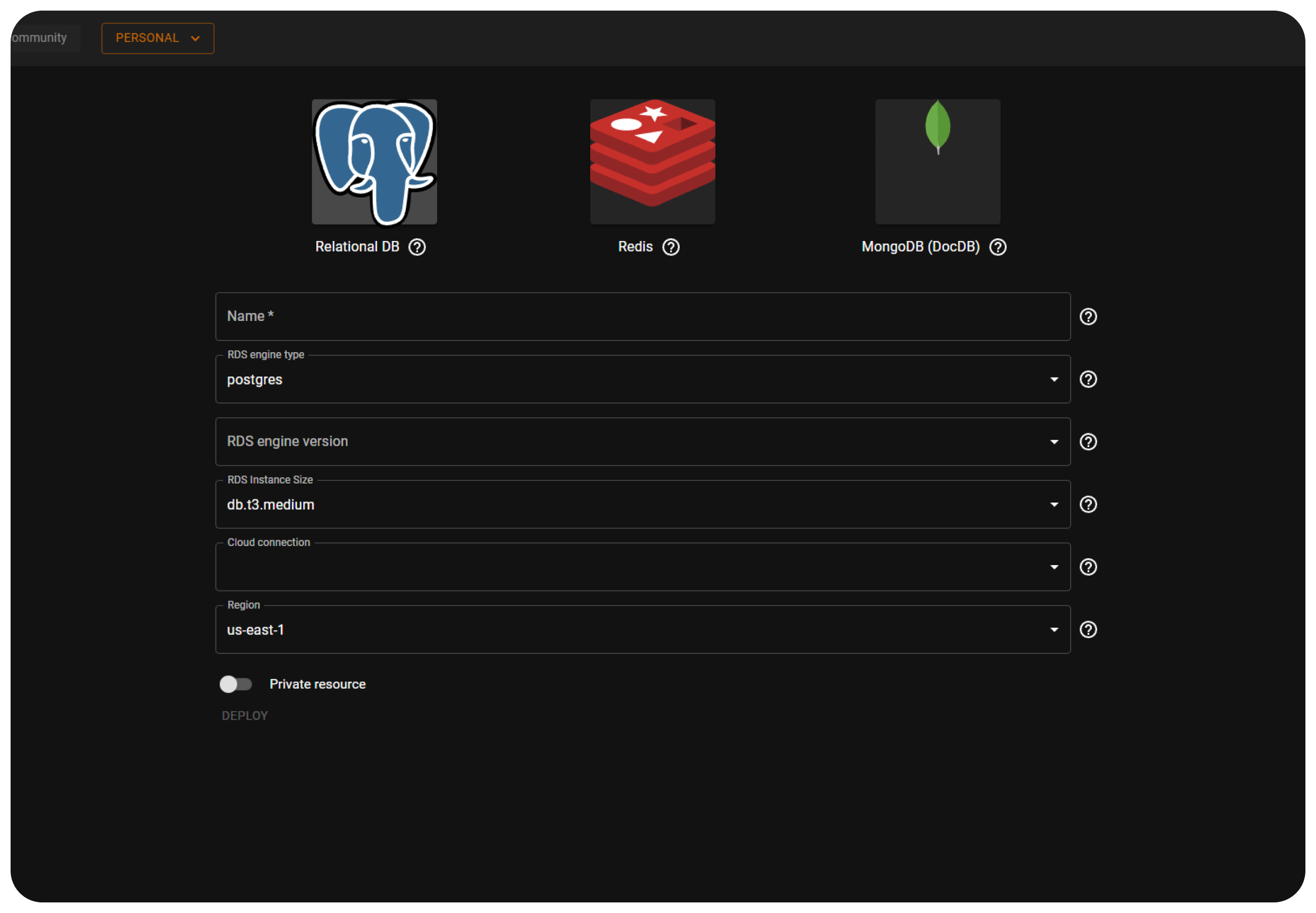
TerraBook is a part of Digger team, who focused at AWS. I designed their child project which help deploying AWS in one click.
Short overview →
#web, #mobile, #research, #redesign, #architecture, #design system, #product design, #user testings, #child project, #aws
2021